Discover three key strategies for optimizing mobile app design and user experience, including simplicity, consistency, and adaptability, with insights on leveraging platforms like Jigx for streamlined development.
- Importance of simplicity in design for readability and performance.
- Significance of consistent UI elements for user familiarity and navigation ease.
- Necessity of adaptive layouts for dynamic adjustment across various screens.
- Introduction to platforms like Jigx for handling UX/UI needs, ensuring scalability and adaptability.
We get it. It can be overwhelming to design apps. Where to start, how to achieve top-tier mobile app design, or when to implement various UX/UI elements are always challenges when you don’t have design support. However, we’ve identified three areas to get your app looking it’s best.
Stay Simple
One of the most important rules (also the easiest to forget) is to keep it simple. It is easy to start adding one UI element after another when developing apps. It can be a cascading effect too. When you add one, you add another, then another, and so on until your app looks more like a dashboard on a spaceship than something you would find on your phone. You don’t want to confuse your audience with busyness. Rather opt for white space and readability. Less is more.
This does not mean that your app should be bland or boring. Too many things happening at once will be hard for your users to focus on using your app, and you’ll see users drop off. With too many elements, you will also sacrifice your app performance. Slow performance is a key reason for users to stop using you apps. Slower loading times frustrate and drive users away.
Use Repeated Elements – Consistency is Key
Consistency across your app is key. The practice of using repeated elements gives your users familiarity. Everyone is more comfortable with things familiar to them so keeping consistent when designing your button sizes, colors, and interactions across your app is imperative.
When your app is consistent it also makes it easier for users to navigate between screens. When your app design is straightforward to navigate your audience will know where to go. It’s common for users to become frustrated when what happens on one screen, doesn’t act the same way on another.
Adaptive Layouts
When putting together your app’s layouts make sure they adjust dynamically to various screen sizes and orientations. You can use various layout mechanisms like Auto Layout on iOS and Constraint Layout on Android to set up adaptable interfaces. Using these layouts allows all UI elements to resize, reposition, and/or rearrange themselves automatically.
If you use flexible UI components that adapt to sizing and arrangement on various screen sizes, make sure to use relative sizing and positioning, not fixed, to help your app scale appropriately.
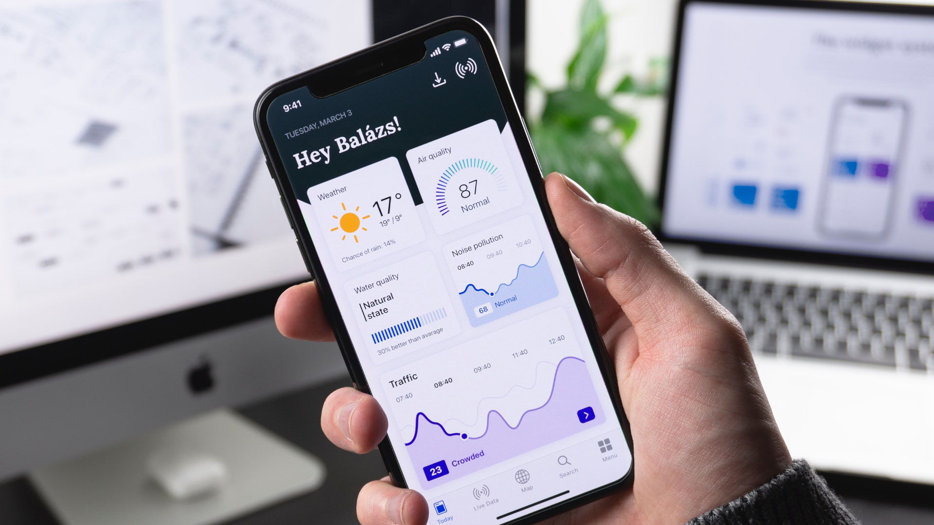
New Platforms that Handle the Design
Good news is there are new platforms that handle the UX/UI for developers. With a native mobile app platform like Jigx, you are freed up from all design needs so you can focus on the features and functions necessary to your app. Use templated components and screens to start your app design, then easily add any customizations you’d like while ensuring both scalability and adaptability.
While frameworks like React Native and Flutter have cut down on the amount of lines needed, they still require a lot of work to make the design user-friendly. With platforms like Jigx, you don’t have to worry about that extra work.
“What takes me 100 to 200 lines in React Native, takes me 10 lines in Jigx” – Andy Hall, CTO ADHD of America.
Designing native mobile apps can be the most frustrating and time-consuming part of a developers build journey. Many times, we let the design slide and hope to worry about it later. While this might have worked in 2008, users demand well-designed userfriendly app experiences. Keep it simple, be consistent, and prioritize adaptability.